1. Overview
A detailed introduction of the projects, including background, motivation, data, tasks and related visualizations.
2. USER GUIDE
A general introduction to this website and each html document.
3. App
A Shinny Application that provide more interactive visual experience.
Question 1
Over the period covered by the dataset, which businesses appear to be more prosperous? Which appear to be struggling? Describe your rationale for your answers.
Answer 1
Prosperous and struggling business based on households’ expense
Path: App -> Prosperous and Struggling Business -> Total Expense over Time
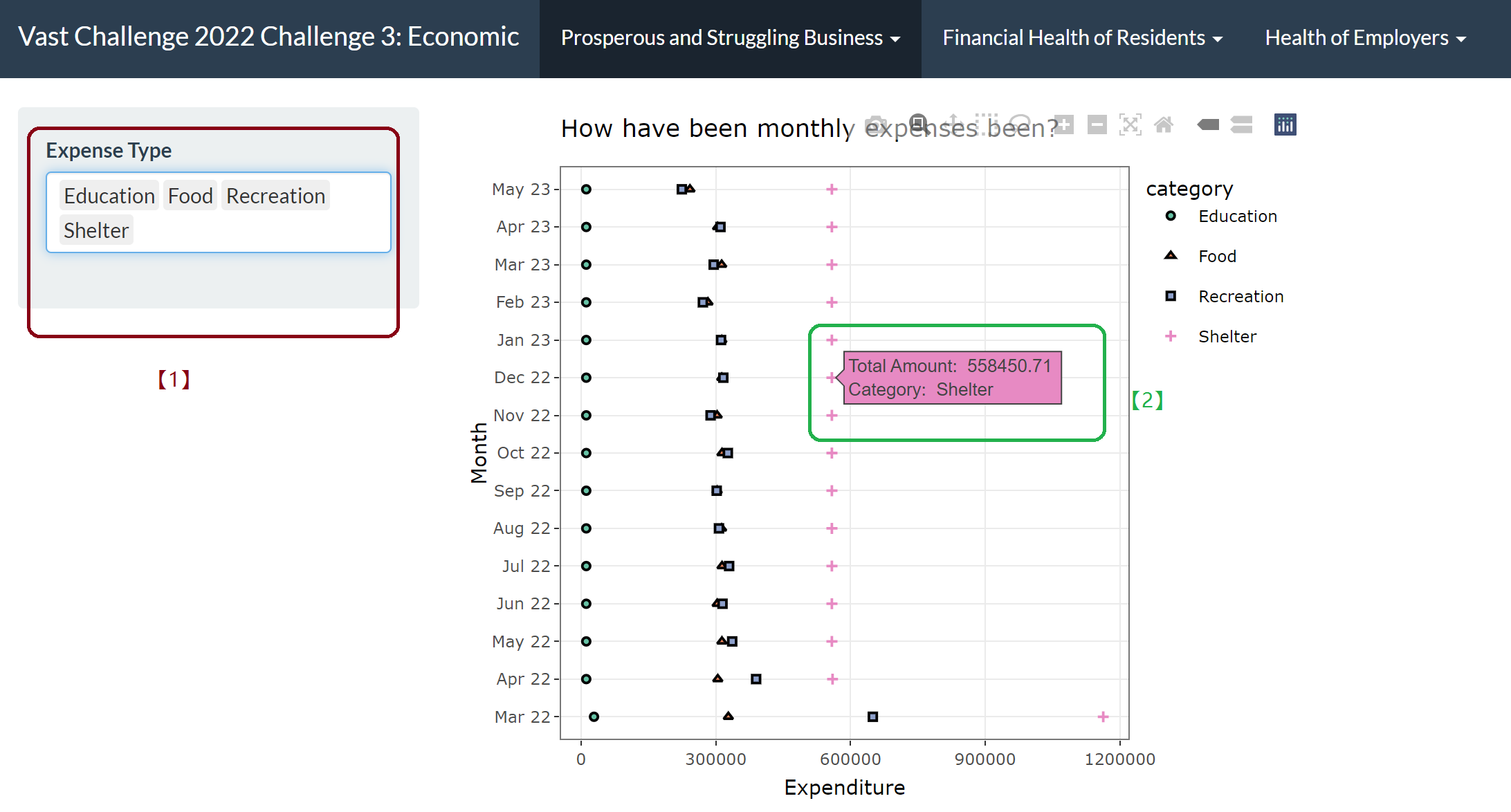
[1] By selecting the drop-down list, we can add or delete different expense category in the table, to compare and observe the expenditure trend in each aspect.
[2] By hanging over each points we can get more details of the category and consuming amount in this category in corresponding month.
Answer 2
Revenue during specific period to compare the prosperity of pub and restaurant industries
Path: App -> Prosperous and Struggling Business -> Business Revenue over Time
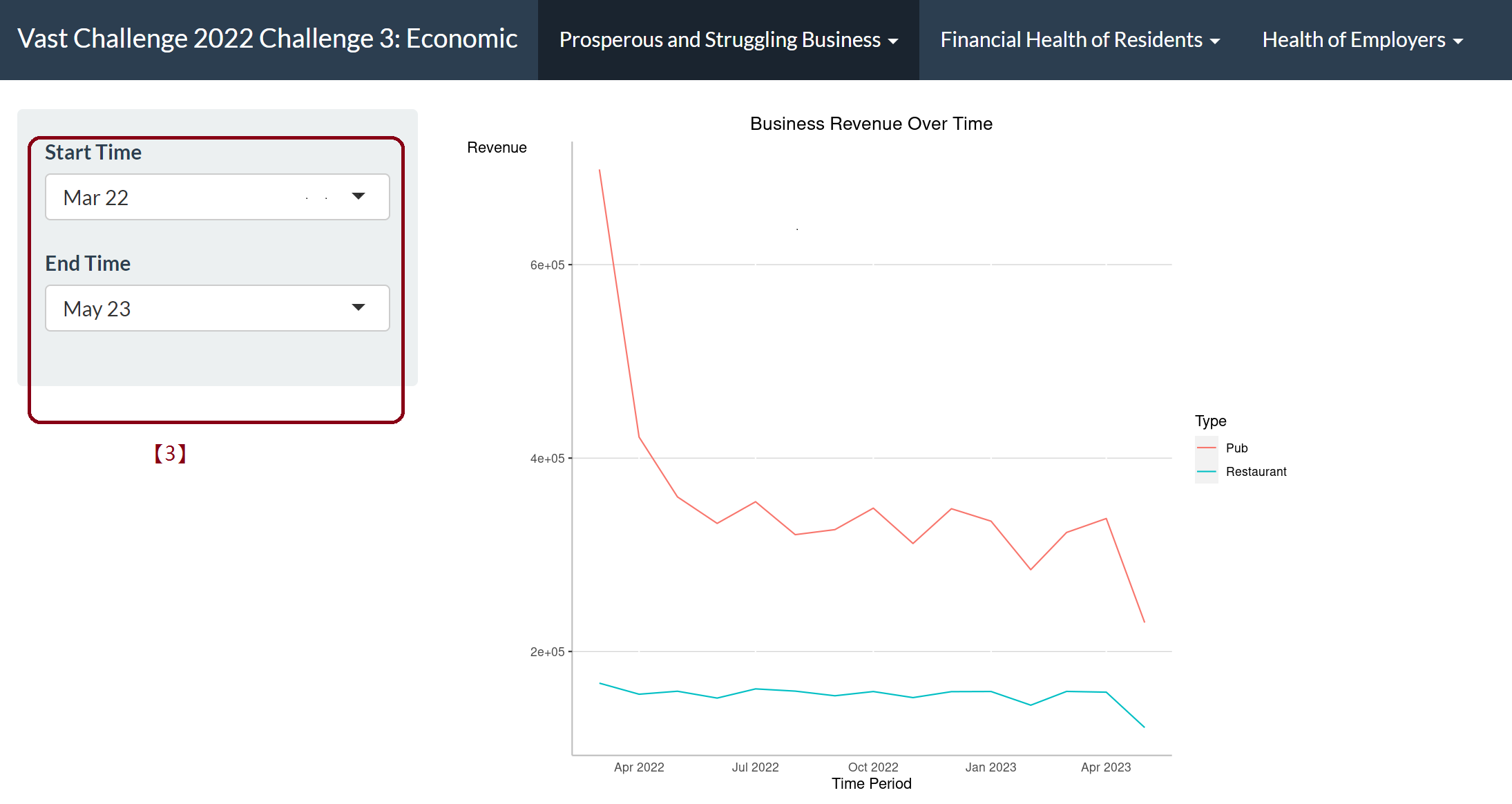
[3] By selecting from the drop-down list of the start time and end time, we can determine which period to take a closer look to understand the prosperity of this two industries.
Answer 3
Monthly revenue trend for each pub/restaurant
Path: App -> Prosperous and Struggling Business -> Pubs Revenue/Restaurant Revenue
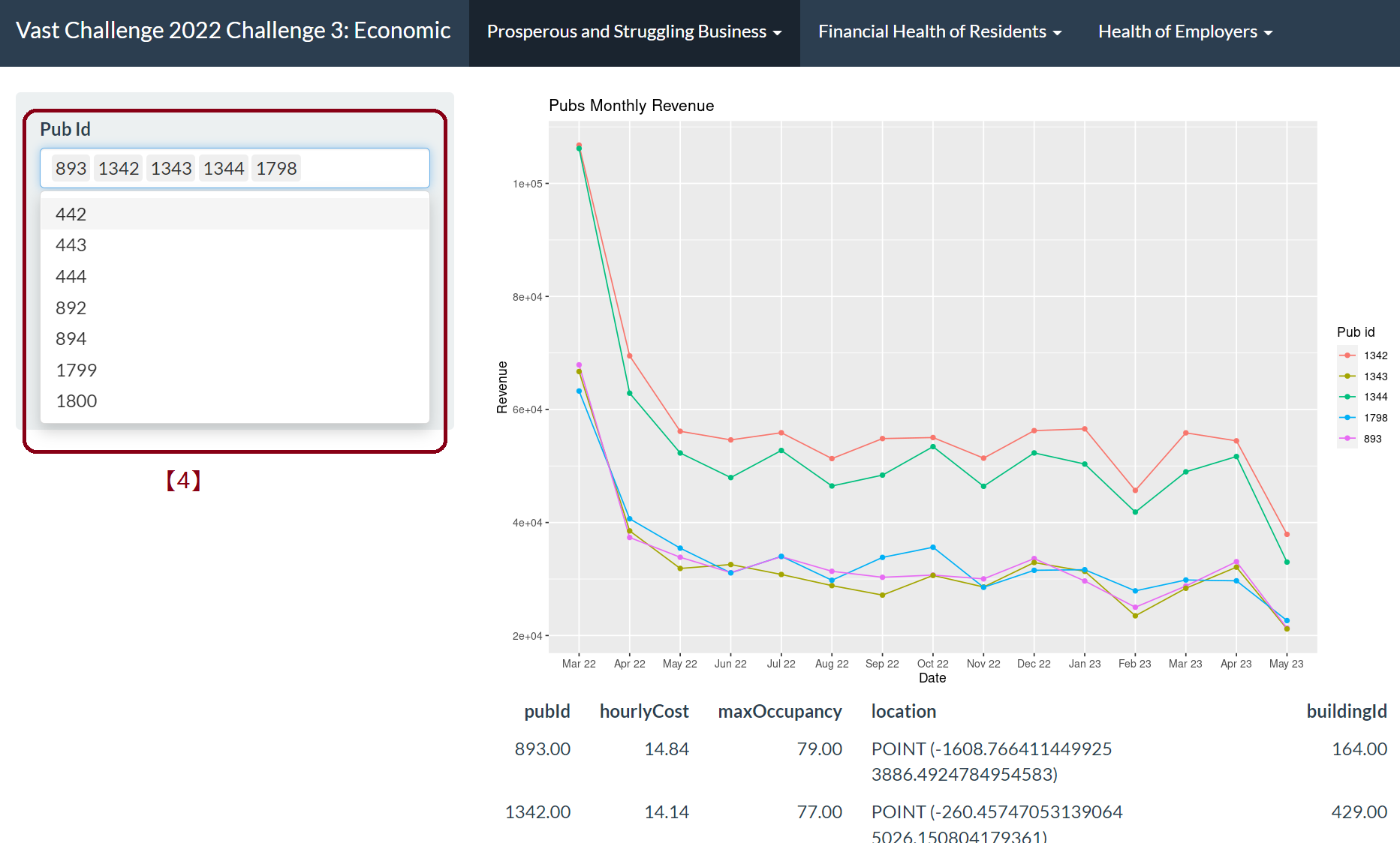
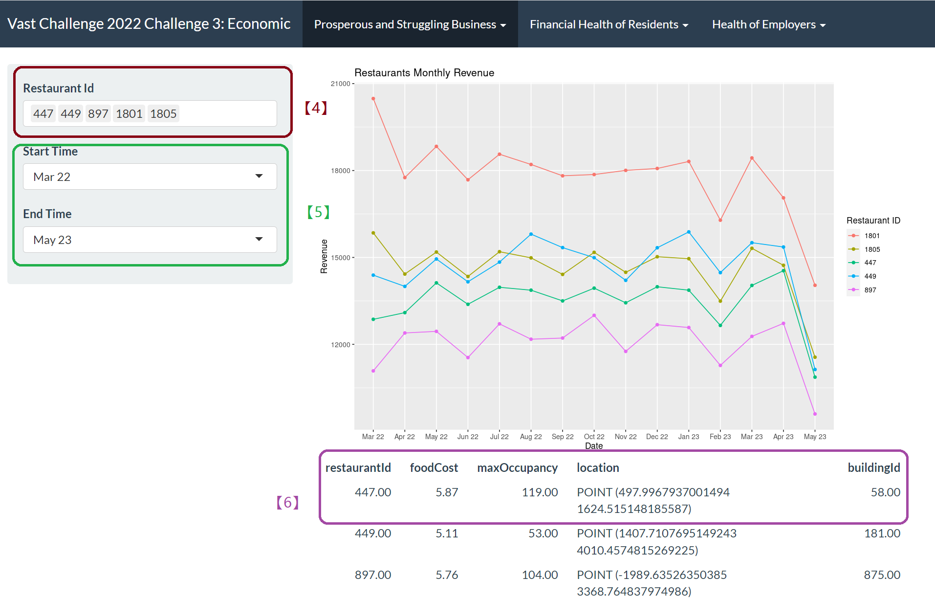
[4] By selecting from the Pub ID drop-down options, we can add or remove pub or restaurant IDs that we want to explore.
[5] We can choose start time and end time to visualize the trend.
[6] We can get access to more details of selected ID in areas under the visualization plot.
Question 2
How does the financial health of the residents change over the period covered by the dataset? How do wages compare to the overall cost of living in Engagement? Are there groups that appear to exhibit similar patterns?
Answer 1
Financial health of the residents change over the period
- Wage/balance and other financial categories change over the period
Path: App -> Financial Health of Residents -> Calculated Financial Index Change by Time
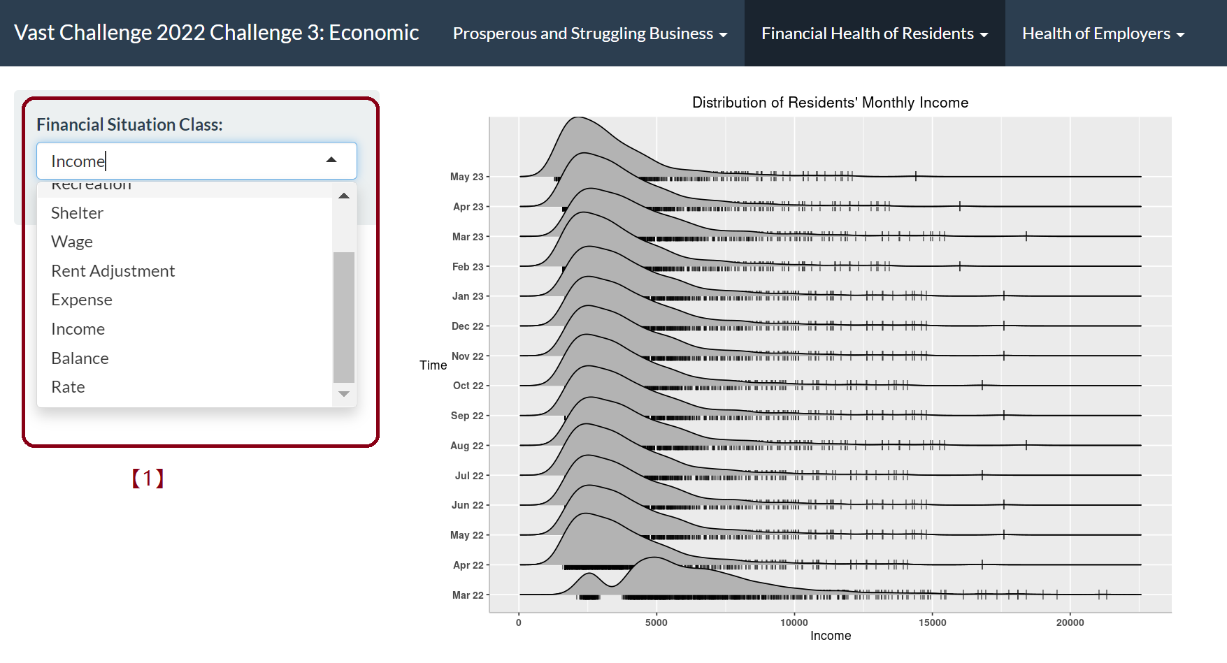
[1] By selecting different category- “Expense”, “Income”, “Balance” or other expenditure on “Food” or “Recreation” etc., we can observe the trend respectively during this 15 months.
- Monthly expense in different categories
Path: App -> Financial Health of Residents -> Total Monthly Expense
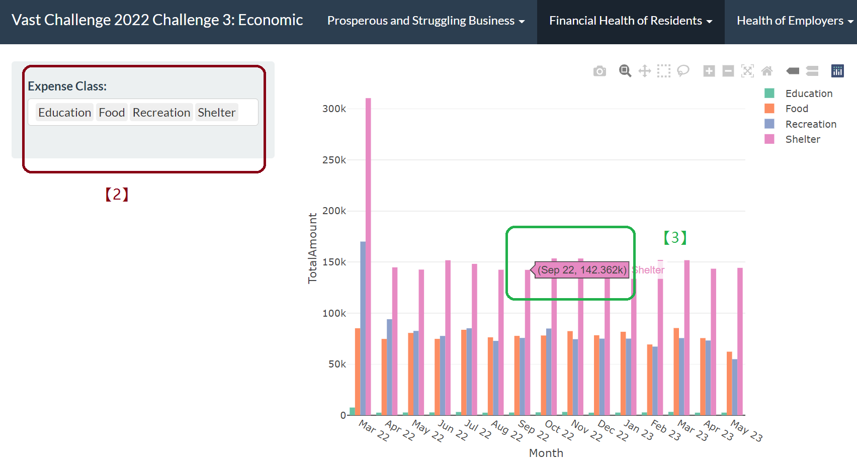
[2] By selecting from the drop-down list, we can select the category for expenditure to plot the bar chart.
[3] Hanging over the graph we can get the detailed time and consuming amount at corresponding point.
- Using Lorenz Curve to show wealth distribution
Path: App -> Financial Health of Residents -> Lorenz Curve
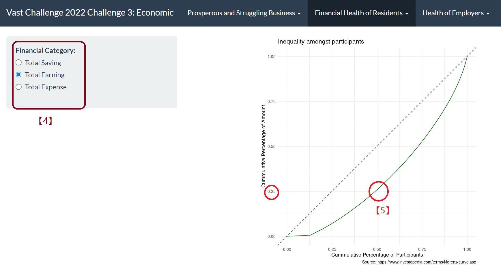
[4] By selecting “Total Earning”, “Total Saving” and “Total Expense”, from the side bar, the Lorenz curve will be shown respectively.
[5] For example, we can observe that 50% of the people control 25% of the income and the other 75% income dominated by the other 50% residents, which shows income inequality. For Total Saving, this balance is even more obvious. You can select “Total Saving” from the drop-down list.
Answer 2
Wages compare with the overall cost of living
- Expenditure/Income rate
Path: App -> Financial Health of Residents -> Wage Compare with Cost Of Living
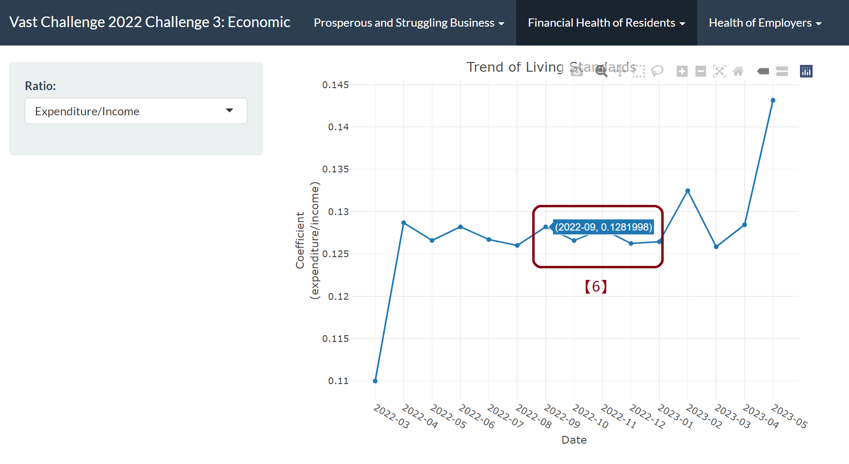
[6] By hanging over the chart, we can access to more details of time and rate.
- Distribution of wage and expense
Path: App -> Financial Health of Residents -> Wage Compare with Cost of Living Monthly
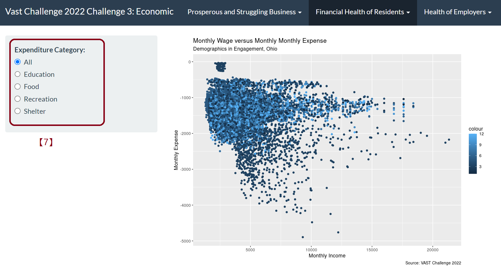
[7] By selecting expenditure category side bar, we can easily observe the relationship between expenditure on different category and monthly income.And the color is based on the category, in other words, the participants education level/interest group. And the color shade represents the month.
Answer 3
Residents’ financial health patterns
- Density plot of financial category of different group
Path: App -> Financial Health of Residents -> Density Distribution of Residents’ Monthly Financial Category
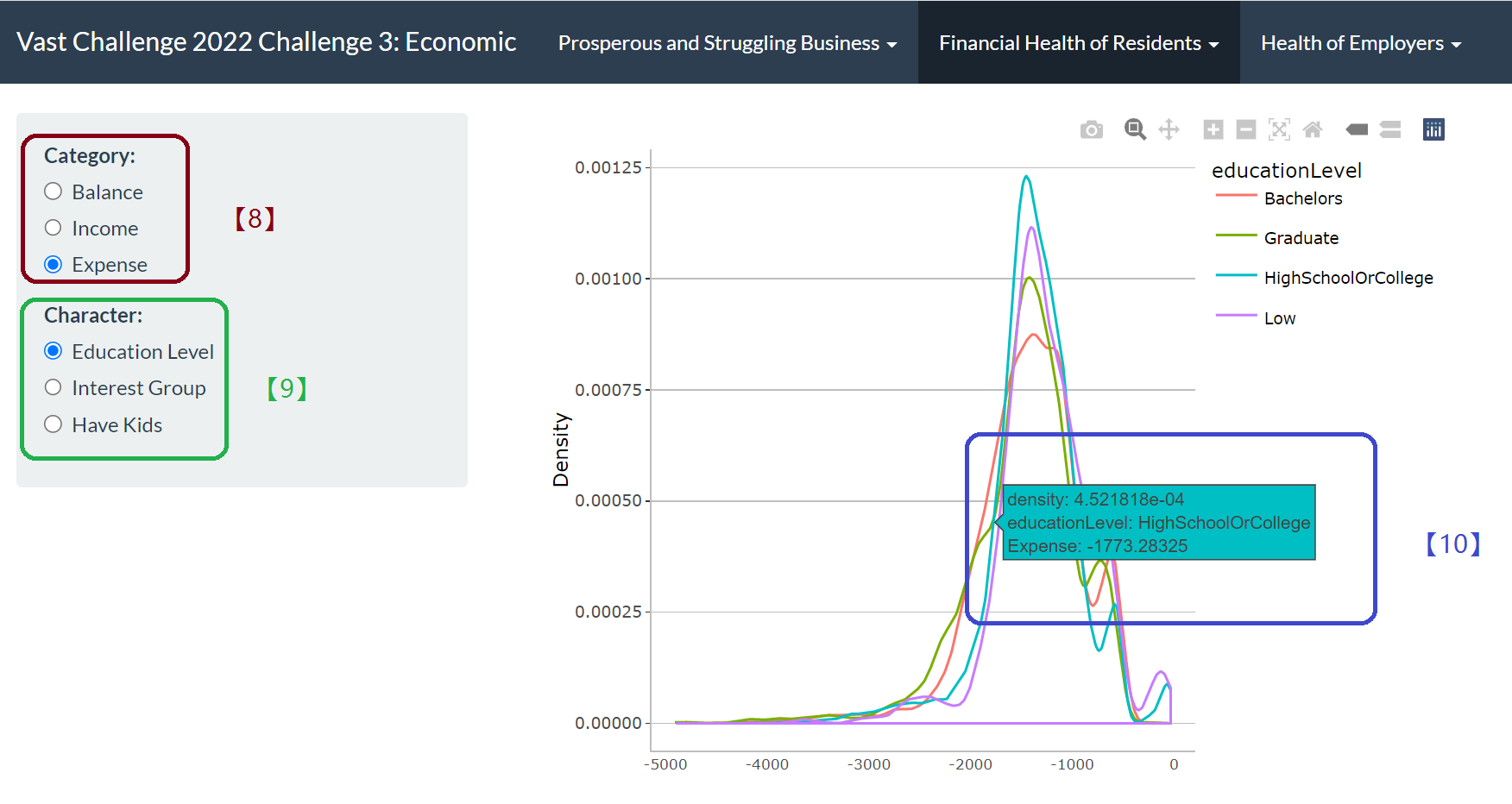
[8] By selecting from the category bar, we can choose balance/income/expense as x axis and get the density line of corresponding category.
[9] By selecting from character side bar, we can choose different variable such as education level to show the distinct character group density line using different color.
[10] Hanging over to know the density, category and character detail.
- Statistical box plot of financial category of different group
Path: App -> Financial Health of Residents -> Monthly Financial Category with Characters
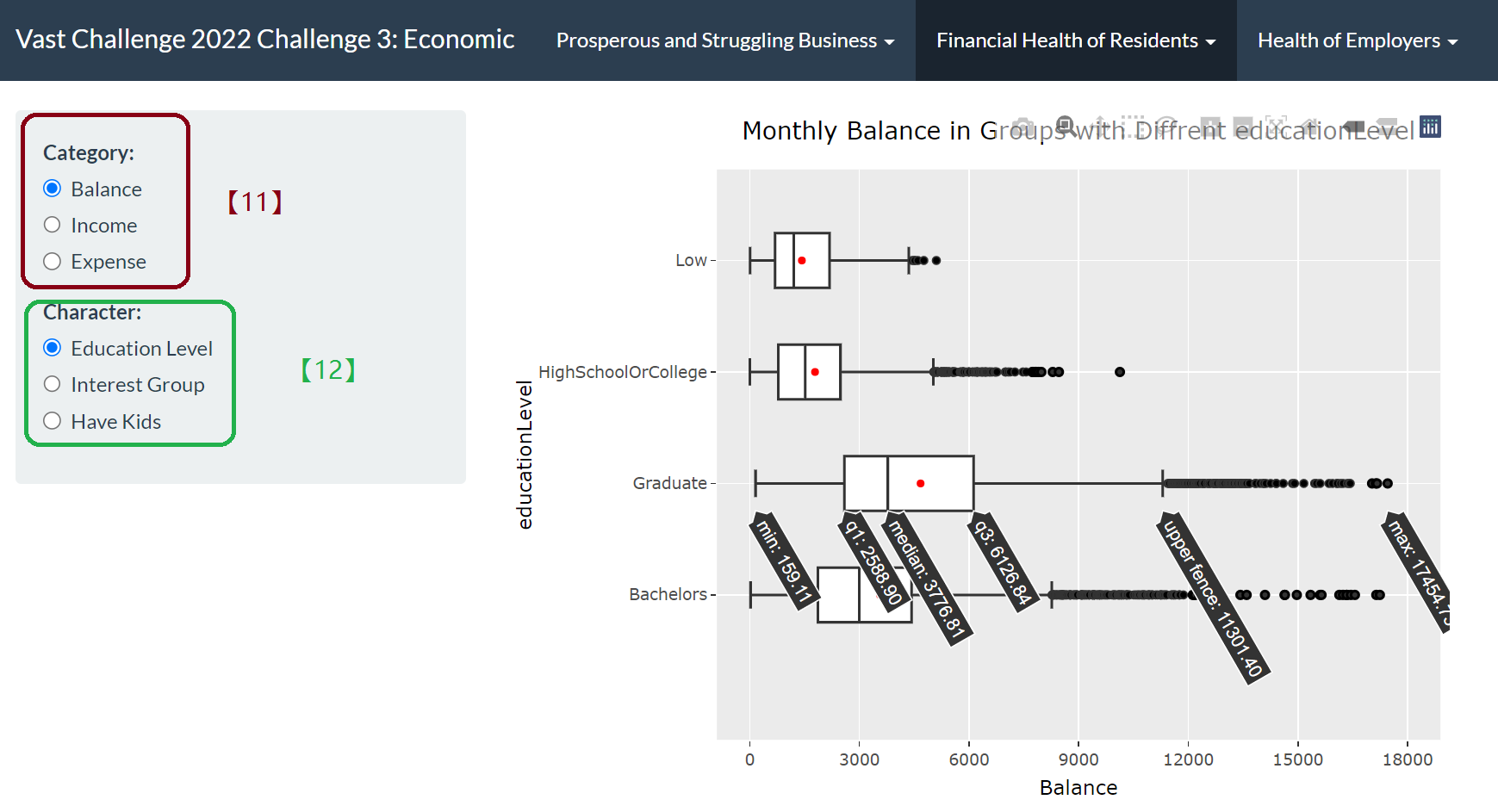
[11] Selecting from the category side bar to determine which category to visualize and reflect in X axis.
[12] Selecting from the character side bar to determine which character to visualize and reflect different group in Y axis.
- A combination (3 factors) of different financial category, residents characters to show financial patterns in scatter plot.
Path: App -> Financial Health of Residents -> Financial Pattern Scatter Plot
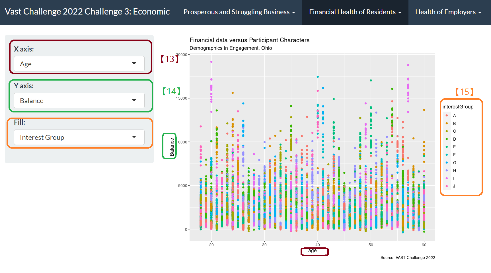
[13] X axis drop-down list is numeric data- age/joviality.
[14] Y axis drop-down is the financial category, including but not limited to wage, food, recreation, balance and balance.
[15] Fill drop-down is the residents’ character group, different color represents different group. By clicking on the variable on the legend, we are able to remove or add different group data from the plot, so that to avoid overcrowded data on the graph and help to compare interactively between different groups.
Question 3
Describe the health of the various employers within the city limits. What employment patterns do you observe? Do you notice any areas of particularly high or low turnover?
Answer 1
The health of the various employer
- In tree map, employers’ employee size represented by the shape, the salary level represented by the shade.
Path: App -> Health of Employers -> Number of Employees Hired by Employers
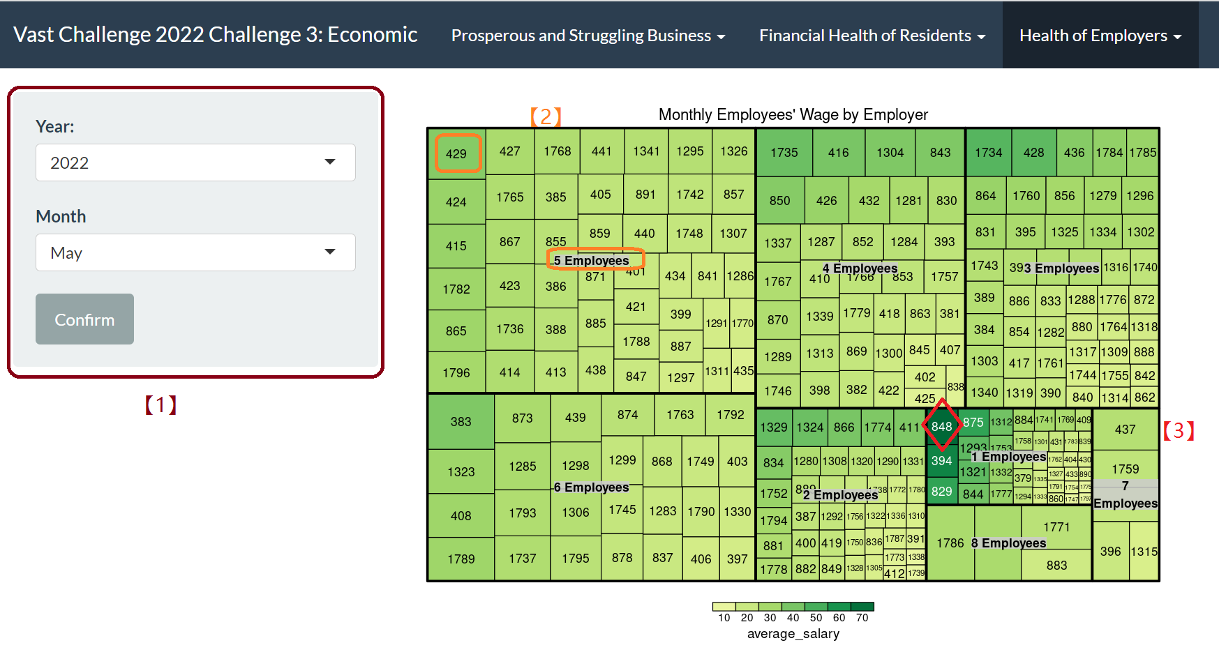
[1] We can select different years and months by drop-down options.
[2] The shape area represents the number of employer having same amount of employee.We can observe that in the selected period, employers who have 5 employees take up the maximum proportion, and among them employer ID 429 provides the highest monthly wage.
[3] The shade represents the monthly salary, the darker, the higher salary. Employer Id 848 offer the highest salary in this month.
Answer 2
Employment patterns
- The influence of education level to salary
Path: App -> Health of Employers -> Job Salary by Different Education Level
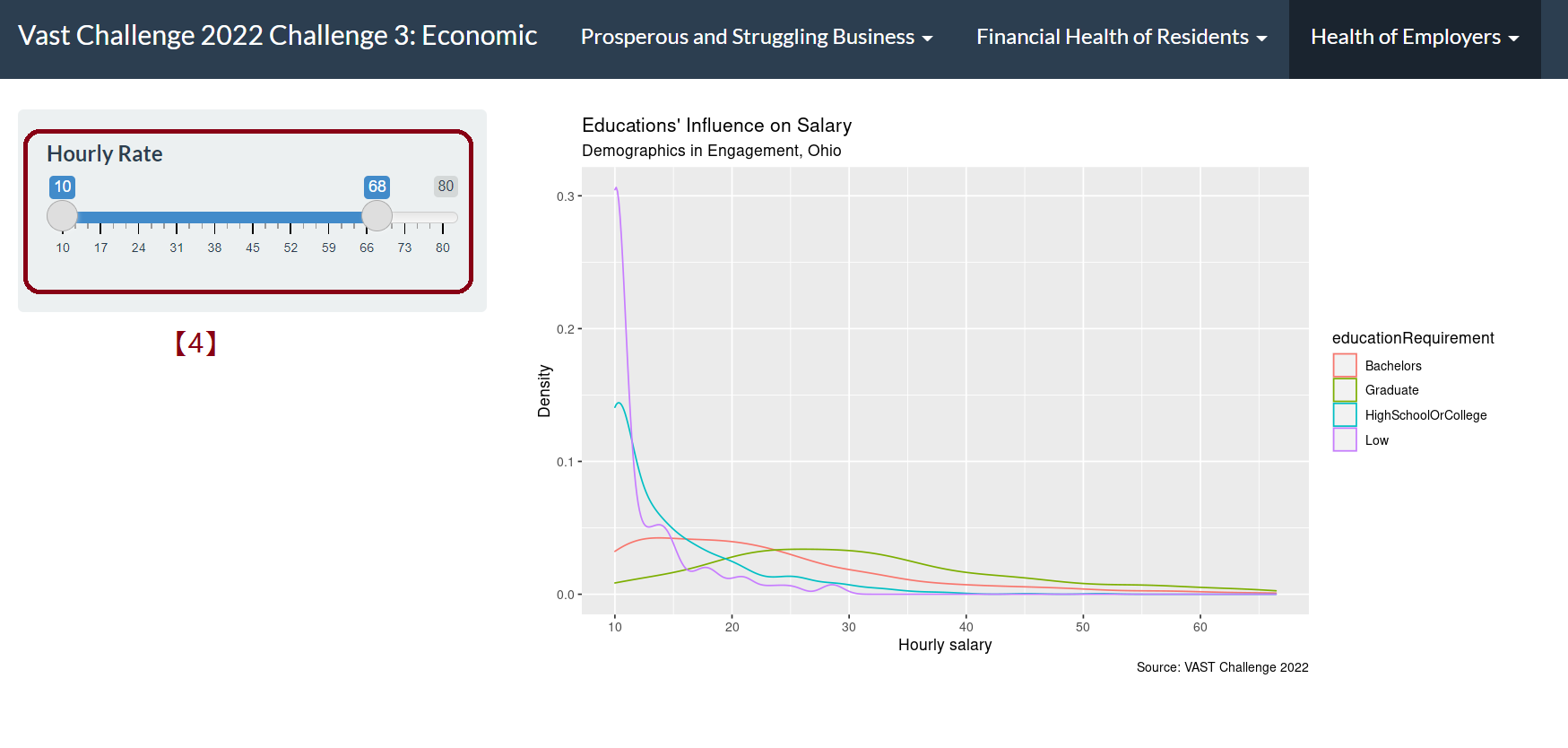
[4] We can observe that for employer with different education level requirements, the salary distribution varies. By dragging the bar, we can take a closer looker into the density difference in different salary.
Answer 3
Turnover
- Turnover frequency according to different employee group: Education level, Working days in weekends, Interest group
Path: App -> Health of Employers -> Job Turnover
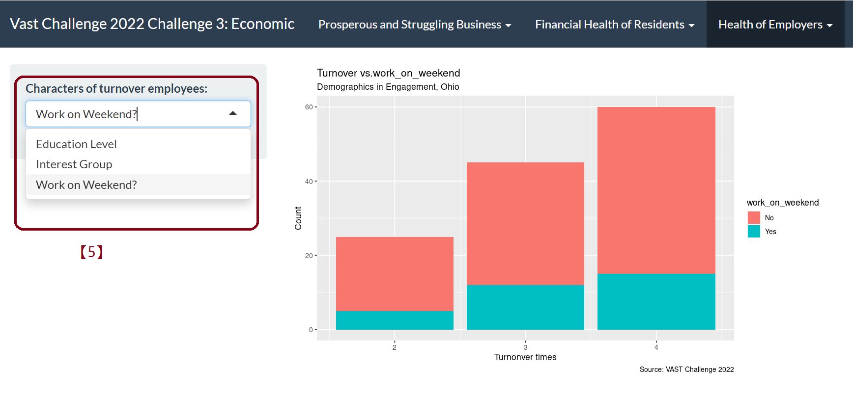
[5] Turnover rate varies from job requirements of different interest group, different education level and working on weekends. By selecting different category from the drop-down list, we can detect different patterns of employment.
4. POSTER
A dashboard having clearer guideline of what we did on our project.
5. ABOUT US
More information of the author and tutor.
6. Future Work
In order to better illustrate the prosperity of various industry, more data on the profitability, cost rate and growth scale of different business are needed.
More detailed data are needed to support the exploration of residents’ financial health and employers’ financial Health, so as to further explore the impact of different factors on living standards and economic levels.
Due to time and shinny application skills limitation, some other visualization methods have not been tried. More insight can be gained by improving the visualization methods.